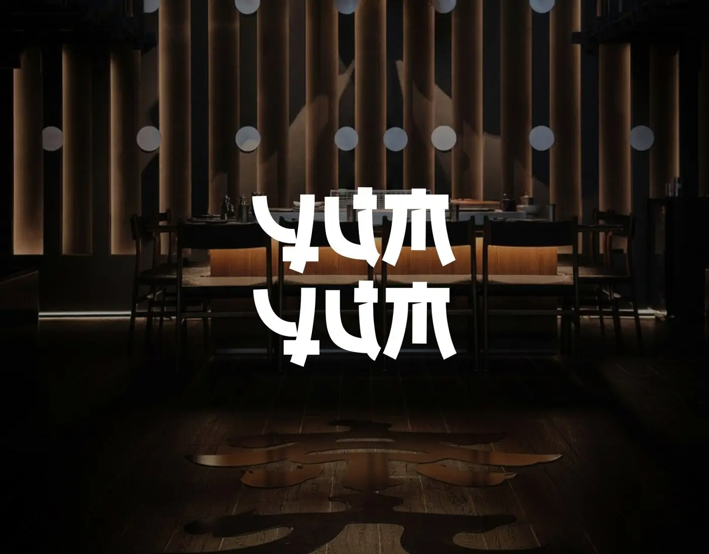
YumYum
A Japanese restaurant brand that runs from the street sign to the takeaway box.
- Scope
- Brand identity, packaging, menu and social
- Role
- Designer, brand identity
The brief
YumYum serves authentic Japanese food, with fresh sushi and traditional flavours to eat in or take away.
The identity had to feel true to Japan and travel well, from the menu and the bag to social posts.
3 design decisions
A stacked wordmark
The two words stack into one block, drawn with strokes that echo Japanese lettering.
Red on black
A strong red on deep black, with a traditional wave pattern behind the mark.
Built for takeaway
Cups, bags and boxes carry the mark, so takeaway looks as good as the dining room.
Related
 ALPHA
Free 20 minute call · Sunday to Thursday